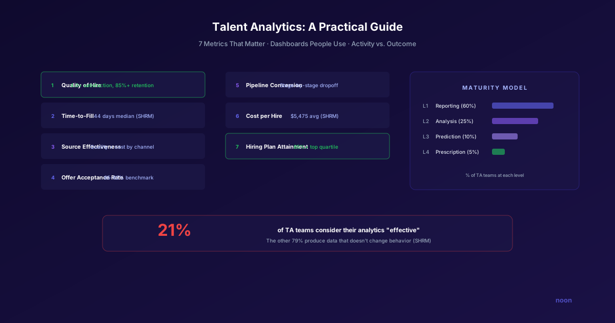
Key takeaway: Only 21% of TA teams consider their analytics capabilities effective — the problem isn't data, it's building dashboards people actually use. The essential talent analytics stack measures four dimensions: pipeline health (velocity, conversion rates), source effectiveness (cost and quality by channel), hiring quality (90-day retention, hiring manager satisfaction), and capacity planning (req-to-recruiter ratios, workload forecasting).
Most recruiting teams are measuring too many things and learning from too few of them.
Industry guides list anywhere from 13 to 45 "essential" recruiting metrics. Somewhere in that range, the dashboard becomes an obligation — a Monday morning report that generates numbers but doesn't drive decisions. A SHRM survey found that only 21% of talent acquisition teams consider their analytics capabilities "effective" or "very effective." The remaining 79% are producing data that doesn't change behavior.
The solution isn't more metrics. It's fewer metrics, better connected to specific decisions, and designed for different audiences.
This guide covers how to build a recruiting analytics practice that actually improves hiring — starting with the most important conceptual distinction that most TA teams get wrong.
Activity metrics vs. outcome metrics
Before diving into specific metrics, understand this distinction clearly. Confusing these two categories is the single most common reason TA teams collect data without improving performance.
Activity metrics measure what your team is doing:
- Resumes reviewed
- InMails sent
- Interviews scheduled
- Positions posted
- Requisitions managed per recruiter
These are easy to collect, easy to report, and almost entirely useless for improving hiring quality. They tell you how hard your team is working. They tell you nothing about whether the work is producing results.
Outcome metrics measure what your hiring is achieving:
- Quality of hire
- Offer acceptance rate
- First-year retention
- Source-adjusted hire quality
- Hiring plan attainment
These require more effort to collect, more discipline to interpret, and more organizational alignment to act on. But they're the only metrics that actually tell you whether your recruiting is working.
The rule: Track activity metrics only to diagnose outcome problems. If your time-to-fill is increasing (outcome), look at activity metrics (sourcing volume, screening throughput, scheduling speed) to find the bottleneck. But never celebrate activity metrics as achievements.
The 7 metrics that matter
If you could track only 7 metrics, these would tell you whether your recruiting function is healthy.
1. Quality of hire
What it measures: How well your new hires perform and stay.
Formula: Composite score combining:
- Manager satisfaction at 90 days (1-5 scale)
- Performance rating at first review
- First-year retention (still employed after 12 months)
2026 benchmark: Target 4.0+ average manager satisfaction, 85%+ first-year retention.
Why it matters: Quality of hire is the ultimate measure of recruiting effectiveness. Every other metric is a proxy or contributor. If you only track one metric, make it this one.
Challenge: It's a lagging indicator — you don't know if a hire was good until 6-12 months after they start. This means you need to track leading indicators (the other 6 metrics below) to course-correct in real time while waiting for quality data to mature.
2. Time-to-fill
What it measures: Days from requisition opening to offer acceptance.
2026 benchmarks:
- Overall median: 44 days (SHRM, 2025)
- Engineering roles: 35-55 days
- AI/ML roles: 55-70 days
- Executive roles: 60-120 days
- Sales roles: 30-45 days
Why it matters: Time-to-fill directly impacts business productivity. Every day a role sits open is a day of lost output. But optimizing purely for speed can reduce quality — the goal is to be fast enough to stay competitive without rushing decisions.
Trap: Don't benchmark against cross-industry averages. A 44-day fill for a senior ML engineer is excellent. A 44-day fill for a customer support representative suggests something is broken. Always benchmark by role family and level.
3. Source effectiveness
What it measures: Which sourcing channels produce the best hires at the best cost.
What to track per source:
| Source | Hires | Cost/Hire | Quality Score | Time-to-Fill |
|---|---|---|---|---|
| AI sourcing (Noon) | X | $Y | Z | N days |
| Employee referrals | X | $Y | Z | N days |
| LinkedIn (organic) | X | $Y | Z | N days |
| LinkedIn (paid) | X | $Y | Z | N days |
| Job boards | X | $Y | Z | N days |
| Agencies | X | $Y | Z | N days |
| Career page (direct) | X | $Y | Z | N days |
Why it matters: Not all sources are equal. Referrals typically produce the highest-quality hires. AI sourcing produces the best combination of quality and efficiency. Job boards produce volume but often lower quality. Understanding your source mix lets you invest proportionally.
Insight from AI sourcing: When using Noon, the AI generates source effectiveness data automatically — tracking which candidate profiles, outreach approaches, and channels produce the highest response and conversion rates. This data loops back into improved sourcing for future searches.
4. Offer acceptance rate
What it measures: Percentage of offers accepted.
Formula: Offers accepted ÷ Offers extended × 100
2026 benchmark: 85-92% (Gem, 2025). Below 80% signals a problem.
Why it matters: A low acceptance rate wastes all the work upstream — sourcing, screening, interviewing — and leaves you restarting the search. It usually indicates one of three problems: non-competitive compensation, poor candidate experience during the process, or misalignment between what was pitched and what was offered.
5. Pipeline conversion rate
What it measures: Conversion from each stage of your funnel to the next.
Typical funnel:
| Stage | Conversion Rate | What Low Conversion Signals |
|---|---|---|
| Sourced → Screened | 30-50% | Poor sourcing targeting |
| Screened → Interview | 40-60% | Weak screening criteria or candidate experience |
| Interview → Offer | 15-30% | Too many interviews, poor assessment quality |
| Offer → Accept | 85-92% | Comp issues or poor closing |
Why it matters: Pipeline conversion tells you where candidates are falling out and why. It's the diagnostic metric — when an outcome metric (time-to-fill, quality of hire) goes wrong, pipeline conversion data tells you which stage to fix.
6. Cost per hire
What it measures: Total cost to fill a position.
Formula: (Internal costs + External costs) ÷ Number of hires
Internal costs: Recruiter salaries, tools, overhead External costs: Job board fees, agency fees, advertising, events
2026 benchmark: $5,475 for nonexecutive roles, $35,879 for executive roles (SHRM, 2025).
Why it matters: Cost per hire is an efficiency metric, but it must be paired with quality. A $4,500 cost per hire that produces poor hires is more expensive than a $7,000 cost per hire that produces great ones.
7. Hiring plan attainment
What it measures: Percentage of planned hires completed on time.
Formula: Hires made on schedule ÷ Total planned hires × 100
2026 benchmark: Top quartile TA teams achieve 85%+ attainment (Gem, 2025).
Why it matters: This is the metric that matters most to business leadership. It measures whether the recruiting function is delivering on its commitments. A TA team with great activity metrics but 60% hiring plan attainment is failing the business.
Building dashboards people use
The "47 reports nobody reads" problem has a design solution, not a data solution.
Principle 1: Different dashboards for different audiences
| Audience | What They Need | Update Frequency |
|---|---|---|
| TA leadership | Outcome metrics (quality, attainment, cost), trends, source mix | Weekly |
| Recruiters | Pipeline health per req, conversion rates, activity vs. targets | Daily |
| Hiring managers | Status on their specific reqs, candidate pipeline, scheduled interviews | Real-time (self-serve) |
| C-suite / Finance | Hiring plan attainment, cost per hire, workforce planning metrics | Monthly/Quarterly |
Principle 2: Lead with the decision, not the data
Each metric on the dashboard should connect to a specific decision:
- "Should we increase sourcing spend for engineering roles?" → Source effectiveness + time-to-fill by role family
- "Is our offer process competitive?" → Offer acceptance rate + reasons for decline
- "Where are candidates dropping off?" → Pipeline conversion by stage
- "Are we on track for the quarter?" → Hiring plan attainment vs. target
Principle 3: Automate data collection
Manual data assembly is the #1 killer of analytics practices. If someone has to pull data from 3 systems and paste it into a spreadsheet every week, the dashboard will die within 2 months.
Use your ATS's native reporting (Greenhouse, Ashby, and Lever have decent built-in analytics). For more advanced dashboards, connect your ATS to a BI tool (Mode, Tableau, Looker) via API.
AI recruiting tools like Noon generate analytics natively — every search produces data on sourcing effectiveness, response rates, candidate quality, and conversion rates that can feed into your dashboards automatically. If you're evaluating how Noon's analytics integrate with your existing stack, you can book a demo to see the reporting capabilities in action.
Principle 4: Set thresholds, not just targets
A number on a dashboard is information. A number that turns red when it crosses a threshold is actionable.
Example thresholds:
- Time-to-fill > 50 days → Red alert, review search strategy
- Offer acceptance < 80% → Review compensation competitiveness
- Pipeline conversion (interview → offer) < 15% → Review interview process quality
- Hiring plan attainment < 70% at mid-quarter → Escalate resourcing
The analytics maturity model
Most TA teams progress through four stages:
Level 1: Reporting — "What happened?" Weekly reports on activity and basic outcomes. This is where 60% of teams are today.
Level 2: Analysis — "Why did it happen?" Drilling into root causes of trends. Connecting source data to quality data. About 25% of teams.
Level 3: Prediction — "What will happen?" Using historical data to forecast time-to-fill, attrition risk, and hiring plan attainment. About 10% of teams.
Level 4: Prescription — "What should we do?" AI-powered recommendations based on data patterns. "Increase sourcing effort for this role — based on historical patterns, the current pipeline won't produce a hire within the target timeline." About 5% of teams.
Move through these levels sequentially. Trying to jump to Level 3 without solid Level 1-2 foundations produces unreliable predictions.
Related reading
FAQ
How many metrics should we track? 5-7 outcome metrics as your core dashboard, with activity metrics available for diagnostic drill-downs. More than 10 core metrics means none of them get enough attention. Track quality of hire, time-to-fill, source effectiveness, offer acceptance, pipeline conversion, cost per hire, and hiring plan attainment as your foundation.
What if our ATS doesn't have good reporting? Most modern ATS platforms (Greenhouse, Ashby, Lever) have adequate native reporting for Level 1-2 analytics. For Level 3-4, you'll likely need a BI integration. If your ATS has truly poor reporting, consider whether that's a reason to evaluate alternatives — analytics capability is increasingly table-stakes for ATS platforms.
How do we measure quality of hire? The most practical approach: combine 90-day manager satisfaction (quick survey), first performance review rating, and 12-month retention. Start collecting this data consistently and you'll have useful quality signals within 6-12 months.
Should AI recruiting tools replace our analytics stack? Not replace, but enhance. AI sourcing platforms like Noon generate real-time analytics on sourcing effectiveness, candidate quality, and pipeline conversion that complement your ATS-based dashboards. The AI data is especially valuable for understanding which sourcing strategies work best for different role types.